Luminous Blue 2027 is already making waves as one of the colors to watch for 2027. WGSN and Coloro selected the vivid blue as their 2027 Color of the Year, placing it among the key shades they expect to influence design and consumer trends in the year ahead.
Unlike the softer, muted blues we’ve seen dominate interiors in recent years, Luminous Blue is bold, energetic, and unmistakably vibrant. The good news? You don’t have to paint an entire room blue to embrace the trend. A single accent piece, a colorful chair, or even a few carefully chosen accessories can bring the shade into your home without overwhelming the space.
So, how do you actually decorate with a color this bold? The trick is knowing what to pair it with, where to use it, and how much is enough. Here’s how to bring Luminous Blue into your home in a way that feels stylish and intentional—not like you simply followed the latest color trend.
What Is Luminous Blue, Exactly?
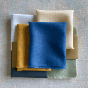
Luminous Blue is a vivid, almost electric blue with real depth to it, closer to a sapphire or cobalt than a navy or powder blue. What makes it interesting is its dual identity: it’s rooted in one of the oldest pigments in history, lapis lazuli, while also feeling completely modern and forward-looking.
Forecasters describe it as both a heritage color and a color of the future, which is part of why it’s resonating right now. It manages to feel grounded in something timeless while still looking like nothing you’ve painted your walls before.
Why This Color Is Different From “Just Another Blue”
I get it if you’re feeling a little blue fatigue. However, Luminous Blue isn’t trying to be a soft, restful color the way so many recent blues have been. It’s meant to be noticed. Think less “spa day,” more “the piece everyone asks about when they walk into your living room.”
That’s an important distinction. Past blue trends have leaned muted and calming dusty denim, soft slate, powder blue. Luminous Blue skips that entirely and goes electric instead. It’s confident rather than quiet, which is exactly what makes it worth paying attention to as its own moment, not just another entry in the blue rotation.
The Golden Rule: One Statement Piece, Everything Else Quiet
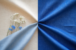
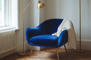
If there’s one thing to remember before you touch this color, it’s this: Luminous Blue works best as the star, not a supporting player. Once you’ve chosen where it lives in a room, whether that’s a sofa, an accent chair, or a single wall, let everything else settle into the background.
Pair it with natural materials that don’t compete warm oak, linen, off-white plaster, a little brass. The goal is a room where your eye goes straight to the blue and then settles comfortably into everything around it. Most importantly, resist the urge to add a second bold color into the mix. This trend is about commitment to one strong moment, not a color explosion.
How to Bring It In Without Repainting Everything
If a full commitment feels like a lot right now, there are plenty of smaller ways to test this trend before you go all in. On top of that, this is the most budget-friendly way to see if you actually love it in your own space.
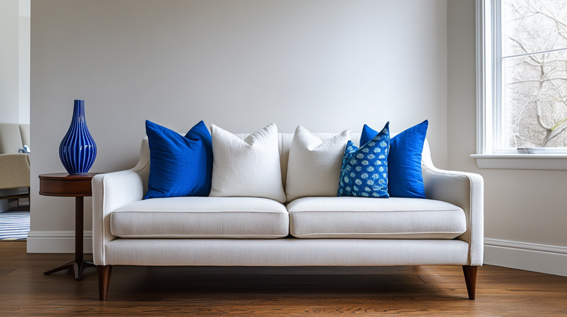
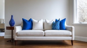
- Add a few blue throw pillows to an otherwise neutral sofa
- Bring in a statement vase or ceramic piece as a single pop of color
- Swap in blue artwork or a framed print
- Try a blue table lamp or lampshade for an easy evening glow
Once you’ve lived with a smaller dose for a few weeks, you’ll have a much better sense of whether you’re ready to go bigger.
Going Bigger: An Accent Wall or Statement Sofa
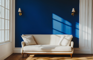
Ready to commit? An accent wall or a statement sofa are the two biggest ways to bring Luminous Blue into a room, and both work well as long as you keep the rest of the space simple.
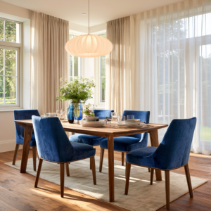
For an accent wall, pair it with warm wood tones, unlacquered brass fixtures, and soft linen textiles nearby. For a statement sofa or dining room furniture, keep your walls in a warm off-white or pale clay tone so the piece has room to be the focal point. Either way, the surrounding materials should feel warm and natural, not cool or stark, so the blue has something to play off of instead of competing with matching cool tones.
What to Pair (and Avoid Pairing) With Luminous Blue
To finish things off, here’s a quick cheat sheet for pairing this color successfully:
Pairs beautifully with:
- Warm oak and walnut wood tones
- Brass and unlacquered bronze hardware
- Linen, wool, and other natural textiles
- Off-white and warm clay wall colors
Tends to clash with:
- Cool gray walls or furniture
- Stark, bright white without any warmth
- Chrome or overly polished silver fixtures
The bottom line is that warmth is what makes this particular blue sing. Keep the room’s other materials leaning warm, and Luminous Blue will feel intentional rather than jarring.

Getting Ahead of the Trend
All in all, this is a rare chance to get ahead of a color story before it’s officially declared by every major paint brand. Whether major paint brands follow the same direction remains to be seen, but Luminous Blue has already established itself as an important 2027 forecast color through WGSN and Coloro.
The bottom line is that you don’t need to wait for that announcement to start enjoying it. Start small with a pillow or a vase and see how it feels in your own space. By the time everyone else catches on, you’ll already know exactly how to use it.
My Picks: Luminous Blue Essentials
- Cobalt Blue Throw Pillows — an easy, low-commitment way to test this color trend on your existing sofa.
- Statement Ceramic Vase in Electric Blue — a bold pop of color that works as a single styling moment.
- Blue Velvet Accent Chair — for a bigger commitment that still keeps the rest of the room flexible.
- Unlacquered Brass Drawer Pulls — the perfect warm-toned pairing to bring out the richness of this blue.
- Warm Oak Side Table — grounds the space in natural material the way this trend calls for.
Are you a “one bold statement piece” person, or more of a “small pop of color” person when it comes to trying a trend like this? I’d love to hear which approach you’re leaning toward in the comments. And if you want to see how this color fits into the bigger 2027 color story, keep an eye out for my upcoming post on all seven of the year’s forecasted color moods.