For years, red has had a reputation for being difficult to decorate with. But maybe it is time to Rethink Red. It can feel bold, energetic, and even a little intimidating.
Redecorating with red means moving beyond bright cherry walls and predictable holiday accents and discovering the warmer, earthier, more sophisticated side of this powerful color.
In 2026, designers are embracing red in a much more nuanced way. Instead of treating it as a color that has to dominate a room, red is being used as an accent, a grounding shade, and even a surprisingly elegant neutral. Deep burgundy, oxblood, rust, cranberry, brick, and earthy reds are bringing warmth and personality back into interiors.
And that makes red much easier to live with.
Whether you want to add one small pop of color or completely transform a room, there is a version of red that can work beautifully in your home.
Why Red Is Having a Moment Again
Interior design has been moving away from overly sterile, all-white spaces and toward rooms that feel warmer, layered, collected, and personal. Red fits naturally into that shift.
In fact, red and burgundy have been identified by designers as important interior colors for 2026, while deeper shades such as oxblood and burgundy have seen a significant increase in designer interest.
But this isn’t necessarily a return to the bright red accent walls of decades past.
Instead, today’s red is:
- Earthier
- More muted
- Warmer
- More sophisticated
- Often darker
- Easier to combine with neutrals
- Used in smaller, intentional doses
Think aged brick instead of fire-engine red.
Think cranberry velvet instead of glossy cherry.
Think rust-colored pottery instead of a room full of primary red.
That’s the red worth rethinking.
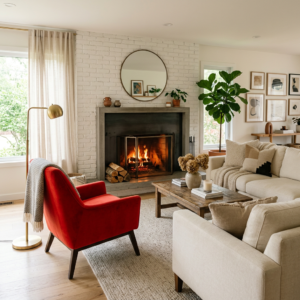
The Unexpected Red Theory
One popular decorating idea that has spread across social media is the ‘Unexpected Red Theory,’ which suggests that a small hit of red can add visual interest to an otherwise neutral space.
The concept is simple: add a small amount of red somewhere you wouldn’t necessarily expect it.
It might be:
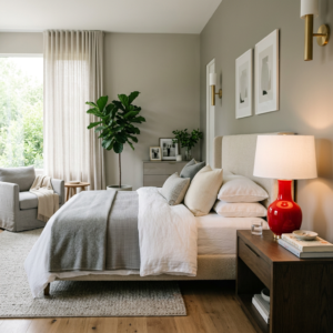
- A red lamp in a neutral bedroom
- A burgundy chair in a cream living room
- A red picture frame
- A cranberry throw pillow
- A small red cabinet
- A red stripe in a rug
- A painted interior door
- A collection of red pottery
- A vintage red stool in the kitchen
The idea isn’t necessarily to make red the star.
Instead, that unexpected touch gives the room a visual punctuation mark.
And sometimes that’s exactly what a neutral room is missing.
Try Earthy Red Instead of Bright Red
If traditional red feels too intense, start with an earthy red.
Earthy reds have brown, clay, orange, or muted undertones that make them feel much more natural.
Think:
Terracotta + brick + cinnamon + clay + rust
These shades work particularly well with natural materials such as:
- Wood
- Linen
- Rattan
- Woven baskets
- Stone
- Leather
- Jute
- Aged brass
This combination creates a room that feels warm without looking overly colorful.
Current 2026 design coverage is leaning toward richer, more nuanced color palettes. ELLE Decor’s reporting on 2026 color trends highlights deeper jewel tones and subdued cranberry reds, while its coverage of kitchen colors has pointed to burgundy and oxblood as sophisticated alternatives to brighter reds.
Try this combination:
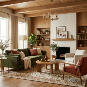
Warm ivory + earthy red + medium wood + aged brass + olive green
The result is warm, collected, and timeless.
Burgundy Is the Grown-Up Red
If you want something moodier, look toward burgundy, oxblood, Bordeaux, or black cherry.
These shades have been gaining considerable attention in interiors because they can behave almost like a neutral when they’re used correctly.
Burgundy works particularly well with:
- Chocolate brown
- Camel
- Cream
- Warm white
- Olive green
- Navy
- Charcoal
- Natural wood
- Antique brass
And there is something especially beautiful about burgundy paired with traditional materials.
Imagine a:
Burgundy velvet chair + warm cream walls + dark wood table + antique brass lamp.
That feels completely different from a room decorated with bright red.
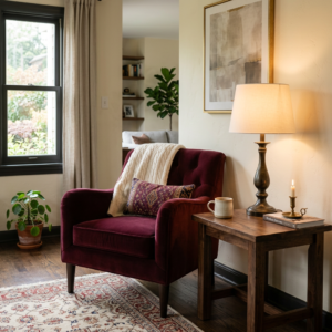
Use Red in Your Living Room Without Repainting
You don’t need to commit to a red wall to experiment with the trend.
In fact, accessories may be the smartest place to start. Redecorating with red can be easy.
Try introducing red through:
Pillows
A pair of burgundy or rust pillows can immediately change the personality of a neutral sofa.
Throws
Look for textured materials such as wool, cotton, linen, or chunky knits.
Artwork
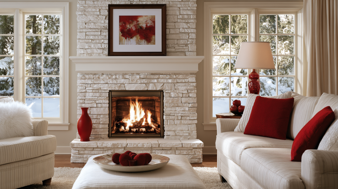
A piece of artwork containing small amounts of red can help connect otherwise unrelated colors throughout the room.
Rugs
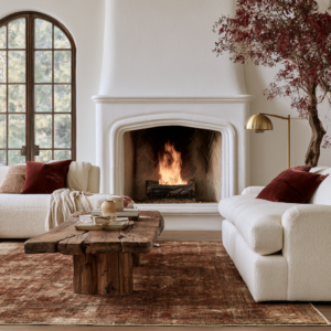
A vintage-style rug containing rust, brick, burgundy, or muted red can become the foundation for the entire color palette.
Decorative objects
Ceramics, books, vases, candles, and picture frames are inexpensive ways to experiment.
This approach also makes the trend much easier to change later.
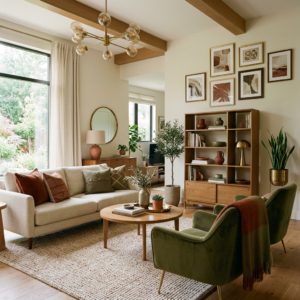
Give Your Kitchen a Little Red
Red might not be the first color you associate with kitchens, but that’s exactly why it can work.
Instead of painting all your cabinets red, consider smaller elements.
Try:
- A red toaster
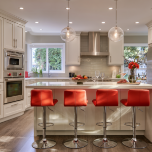
- Burgundy bar stools
- Red ceramic dishes
- A vintage-inspired red runner
- Red pendant lights
- Burgundy kitchen towels
- A small red appliance
- Red artwork
- A painted kitchen island
For an especially sophisticated look, combine burgundy or oxblood with cream cabinetry, warm wood, and brass hardware.
You get the personality of color without sacrificing the timeless feel of the kitchen.
Don’t Forget the Dining Room
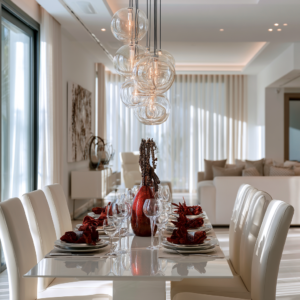
The dining room may actually be one of the best places to experiment with red.
Why?
Deep reds can help create a warmer, more intimate feeling in a dining room, particularly when paired with soft lighting and natural materials.
A deep red dining room can feel dramatic without being cold.
If painting the walls feels like too much, try:
Cream walls + burgundy curtains + wood table + red patterned rug + brass lighting.
Or go slightly bolder with an earthy red wall paired with warm wood furniture.
This is also a great place to experiment with wallpaper that incorporates muted red, botanical green, cream, and brown.
Red in the Bedroom: Use It Carefully
This is where I would be a little more selective.
Bright, highly saturated reds can feel visually energetic, which may not be the effect you’re after in a bedroom.
However, deep burgundy, muted cranberry, dusty brick, and earthy red can create a beautiful cocooning effect when balanced with softer colors.
Try:
- Burgundy bedding
- A rust-colored upholstered bench
- Terracotta curtains
- Muted red artwork
- A vintage rug with red undertones
- Burgundy accent pillows
Then balance the color with:
Cream + oatmeal + natural wood + soft lighting.
The goal is warmth, not visual stimulation.
The Smallest Red Details Can Make the Biggest Difference
Here’s where the Unexpected Red Theory becomes particularly useful.
You don’t necessarily need a large red object.
Sometimes the most interesting details are the smallest.
Imagine a neutral room with:
- A tiny red lamp
- A single red book
- A red ceramic vase
- One burgundy stripe in a pillow
- A small red frame
Suddenly, the room feels more intentional.
The red doesn’t necessarily scream, Look at me.
Instead, it quietly draws your eye around the room.
That’s the difference between decorating with red and using red strategically.
My Favorite Way to Use Red Right Now
OIf you’re hesitant about red, I’d skip the bright primary shades and start with an earthy brick or muted burgundy. My favorite combination is warm ivory, medium-toned wood, olive green, and a small amount of aged brass. It feels colorful without making the room feel overly trendy.
Instead of automatically choosing black and white, try some unexpected combinations.
Red + Sage Green
Earthy and relaxed.
Red + Dusty Pink
Soft and collected rather than overly feminine.
Red + Butter Yellow
Warm, playful, and slightly retro.
Red + Chocolate Brown
Rich and sophisticated.
Red + Navy
Classic with a slightly dramatic edge.
Red + Lavender
Unexpected and artistic.
Red + Cream
Probably one of the easiest combinations to live with.
Red + Olive
Natural and earthy.
The key is choosing the right version of red.
A muted brick red will behave very differently from a bright primary red.
Think Beyond Paint
When people hear “decorate with red,” they often immediately think about painting the walls.
But red can appear in almost anything.
Consider:
Textiles:
Curtains, pillows, blankets, rugs and upholstery.
Wood and furniture:
Painted cabinets, side tables, stools and vintage furniture.
Ceramics:
Vases, bowls, lamps and decorative objects.
Artwork:
Abstract prints, vintage artwork, botanical illustrations and photography.
Lighting:
Lampshades, pendant lights and even colorful glass.
Hardware:
Unexpected red knobs or handles can create a surprisingly playful detail.
This makes red much less permanent.
Could a Red Front Door Be Your Starting Point?
If you’re not ready to bring red inside, look outside.
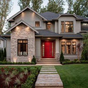
A red front door can add personality to an otherwise neutral exterior without requiring an entire exterior makeover.
Depending on the architecture of your home, consider:
- Brick red
- Deep burgundy
- Cranberry
- Ox blood
- Rust
- Traditional red
Pair it with warm exterior lighting, natural landscaping, and neutral siding or stone.
The result can feel classic rather than trendy.
The Secret to Decorating With Red
The biggest mistake is assuming that every element has to match exactly.
It doesn’t.
In fact, layering different versions of red can create a much richer room.
For example:
Burgundy + rust + dusty brick + terracotta
These colors are related, but they’re not identical.
Add cream, brown, natural wood, and a little brass, and suddenly the palette feels collected rather than coordinated.
That’s an important distinction.
A room shouldn’t necessarily look like you purchased everything from the same collection.
It should look like you collected things you love over time.
A Simple Red Color Palette to Try
If you’re unsure where to begin, try this combination:
| Color | Role |
|---|---|
| Warm Ivory | Main neutral |
| Earthy Brick | Primary red |
| Burgundy | Deep accent |
| Olive Green | Supporting color |
| Warm Wood | Natural element |
| Aged Brass | Metallic accent |
This palette gives you the warmth of red without allowing it to dominate the room.
How Much Red Should You Use?
There isn’t one rule that works for every room, but the 60-30-10 approach can be a useful starting point.
60% — Neutral
Think warm white, cream, beige, or another quiet base.
30% — Supporting Colors
Wood, olive, brown, muted green, navy, or another secondary color.
10% — Red
This is where your burgundy chair, rust pillows, artwork, rug, or other red accents come in.
You can always increase the amount later.
It’s much easier to add color than to convince yourself you love an entire room you’ve just painted red.
Red Doesn’t Have to Be Loud
Perhaps that’s the biggest lesson behind rethinking red.
Red doesn’t have to mean dramatic.
It doesn’t have to mean traditional.
It doesn’t have to mean Christmas.
And it certainly doesn’t have to mean painting every wall bright cherry red.
The newest approach to red is much more interesting.
We’re seeing earthy reds, mellow reds, burgundies, oxbloods, cranberry shades, and warm brick tones used in ways that feel sophisticated and livable. Current 2026 design coverage consistently points toward richer, more nuanced versions of red rather than relying solely on bright reds.
So, if you’ve always said, “I could never decorate with red,” maybe it’s time to reconsider.
You might not hate red.
You might simply have been looking at the wrong red.
The best interior trends don’t require you to completely redesign your home.
Instead, they give you permission to experiment.
Start small.
Add a burgundy pillow. Try a rust-colored vase. Bring home a vintage rug with red running through it. Paint a small piece of furniture. Or, if you’re feeling adventurous, give an entire room a rich earthy-red makeover.
Because sometimes the color we’ve spent years avoiding is exactly the color that gives our home the personality it was missing.