You don’t need a designer’s budget to have a designer’s eye. What separates a room that looks “put together” from one that looks “assembled on sale” isn’t the price tag — it’s the decisions. There is cheap decor out there that looks expensive.
Here’s the truth most decorating content won’t say out loud: cheap looks cheap for specific, fixable reasons. And once you know what those reasons are, you can fake expensive with almost anything.
These are the 12 upgrades interior designers quietly rely on — the ones that cost very little but do the heaviest visual lifting.
1. Your Curtains Are Too Short (And Too Thin)
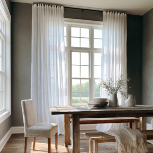
This one is non-negotiable. Short curtains — the kind that hover just below the windowsill — are the single fastest way to make a room feel like a dorm. They chop the wall height visually and signal “I didn’t think about this.”
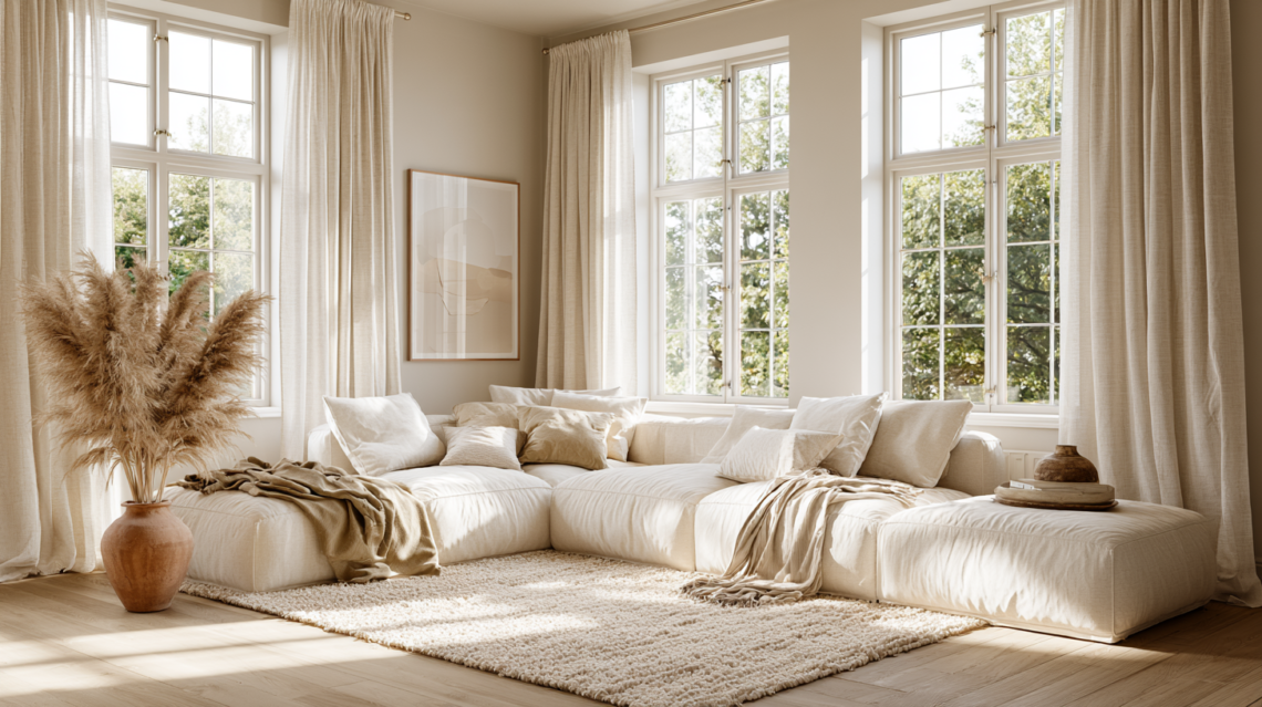
The fix: Hang your curtain rod as close to the ceiling as possible, not the window frame. Let the panels drop to the floor and graze it slightly. Even a $25 pair of IKEA linen curtains looks expensive when hung this way — because height equals luxury.
Also important: thin, sheer polyester panels read as cheap no matter what. Reach for linen, cotton, or a linen-blend texture instead. The weight and drape do all the work.
Waifair.com is a great place to get home decor:
- Linen-blend floor-length curtain panels (96″–108″) — look for unlined natural linen in ivory, oat, or sage. Most come in affordable sets that photograph like a design magazine.
- Adjustable curtain rod with ceiling-mount brackets — the key is getting it as high as possible without a custom install.
2. Everything Is the Same Height (Visual Monotony Is the Problem)
Walk into a room that feels flat and look at the surfaces. Bet you everything is roughly the same height. Matching table lamps on matching nightstands. A row of frames all hung at the exact same level. Objects arranged side by side like they’re waiting for inspection.
Designers call this “visual monotony,” and it’s the quiet killer of otherwise pretty rooms. The eye needs movement — something to travel up, then down, then across.
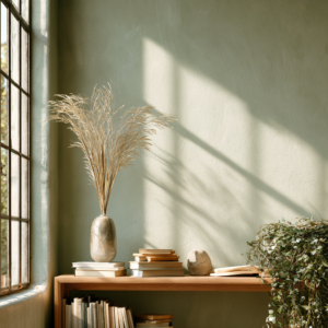
Next time you style a shelf or a tabletop, think in threes and tiers: one tall element, one medium, one low. Stack a few coffee table books to create instant height variation on the cheap. A tall slim vase next to a squat sculptural bowl costs almost nothing but photographs like it cost everything.
The products that fix it:
- Oversized dried pampas or bunny tail stems — adds instant height and warmth. A $12 bundle from Amazon does what a florist charges $80 for.
- Stack-worthy coffee table books Wayfair — art, architecture, and fashion books serve as both risers and décor.
3. Your Art Is Too Small (And Hung Too High)
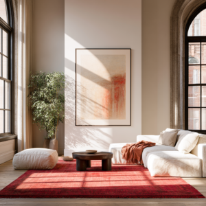
Postage-stamp art on a vast white wall is one of the most common — and most costly-looking — decorating mistakes. It doesn’t matter how beautiful the print is. If it’s too small for the wall, it looks like an afterthought.
The rule designers use: Your art should fill roughly two-thirds of the wall space above the furniture it’s paired with. And it should be hung so the center of the piece sits at eye level — about 57–60 inches from the floor. Not higher.
The good news? Large-scale prints are cheap. A $15 print from Society6 or Etsy, dropped into a simple 24×36″ frame from IKEA’s LOMVIKEN or Amazon, looks like something you paid $400 for at a gallery.
Additionally, a single large piece almost always looks more intentional than a gallery wall done poorly. Sometimes the edit is the upgrade.
The products that fix it:
- Large-scale downloadable art prints (24×36″) — search Etsy for “neutral abstract printable art” and print at a local print shop for under $20.
- IKEA LOMVIKEN or similar thin-profile frame in 24×36″ — minimal, clean, doesn’t fight the art.
4. Your Throw Pillows Are Fighting Each Other
More is not more when it comes to throw pillows. Eight pillows in eight different patterns in eight different sizes is a lot of effort that reads as chaos. And logos? Phrases? Novelty prints? Those age fast and photograph worse.
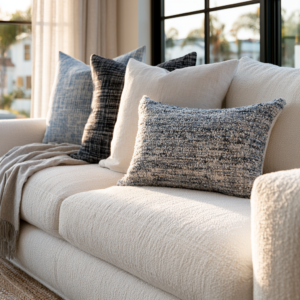
What designers actually do: Keep it to 2–4 pillows per sofa. Vary the texture, not the color story. A chunky boucle next to a flat linen next to a velvet lumbar feels rich because of contrast — not because of complexity. Stick to a palette of 2–3 tones max and let the fabrics do the talking.
That said, the fastest way to make a cheap sofa look expensive is simply to upgrade the pillow covers. The inserts stay the same. You’re just swapping the skin, and a good linen cover costs $18–30.
The products that fix it you can find at Wayfair:
- Linen pillow covers in neutral tones — oat, warm white, sage, or dusty terracotta. Zipper-back styles look cleaner.
- Boucle textured pillow cover — adds the tactile luxury layer without the luxury price.
- Down-alternative pillow inserts (go one size up) — an 18″ cover stuffed with a 20″ insert looks plump and expensive; the right fit makes cheap covers look designer.
5. Your Lighting Is Doing Nothing (Overhead = Flat)
If your overhead light is the only light source in a room, that room will never look expensive. Ever. Overhead lighting is flat, harsh, and institutional — it flattens everything it touches, including your carefully styled surfaces.
Here’s the designer trick: Turn the overhead light off entirely in the evenings. Instead, layer 3 light sources at different heights: a floor lamp, a table lamp, and a small accent or candle. This is called “lighting layers,” and it instantly adds depth, warmth, and the kind of ambiance you see in every single design magazine photo.
For even more impact, swap your overhead bulb to a warm-toned Edison or globe bulb and dim it down. That alone changes the room.
The products that fix it:
- Arched floor lamp with a fabric shade- Wayfair — delivers soft, diffused light and sculptural presence.
- Warm Edison bulbs (2700K or lower) — easy swap that makes every room feel instantly warmer.
- Dimmer switch plug-in adapter — no electrician needed; works on any lamp.

6. Your Rug Is Too Small (This Is Non-Negotiable)
A rug that’s too small for the room is like wearing pants that are too short — technically functional, visually wrong in a way everyone notices but can’t quite name. A floating island rug that nothing sits on makes a room feel disjointed and oddly cheap regardless of what else is in it.
The rule: In a living room, the rug should be large enough that at least the front two legs of every major piece of furniture sits on it. Ideally all four. For most living rooms, that’s an 8×10′ minimum — which sounds expensive but doesn’t have to be.
A jute or sisal rug in a large size runs $80–150 on Amazon and photographs beautifully because of the natural texture. Flatweave cotton, washable rugs, and overdyed vintage-style rugs also give high-end results at low prices when sized correctly.
The products that fix it found on Wayfair,com:
- Large jute or sisal area rug (8×10′ or 9×12′) — natural texture reads expensive, cleans easily, works in almost every aesthetic.
- Low-pile washable area rug — great for high-traffic rooms; several look genuinely designer at a fraction of the cost.
- Rug pad — non-negotiable for safety and keeping a cheap rug looking intentional and flat.
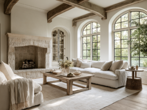
7. Your Surfaces Are Too Cluttered (Or Too Bare)
There are two surface sins: clutter and emptiness. Both look unintentional, and unintentional is the enemy of expensive.
Clutter says “I ran out of time.” A completely bare surface says “I ran out of ideas.” What designers aim for is curated — a small, deliberate grouping that feels like it was considered, not collected.
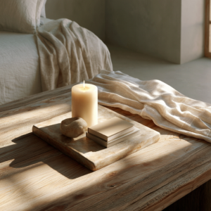
The tray trick: A tray is a designer’s cheat code. Drop a tray on any surface — coffee table, ottoman, kitchen counter — and suddenly whatever is inside it looks intentional. A candle, a small dish, two books, and a tiny object. That’s it. That’s the whole formula.
Keep only what’s beautiful or meaningful on any given surface. Box up the rest. The edit usually matters more than what you add.
The products that fix it:
- Round or rectangular decorative tray in rattan, wood, or marble – Wayfair — the instant “curated” signal for any flat surface.
- Pillar candles – Wayfair or sculptural taper candles — cheap, beautiful, and they add warmth even unlit.
8. Your Metals Aren’t Consistent (Mixing Wrong)
A chrome lamp next to a gold picture frame next to a brushed nickel cabinet pull is one of those things that bothers people without them knowing why. It reads as “grabbed different things from different stores on different days” — which is, to be fair, how most of us shop. But it costs nothing to fix once you know it’s the problem.
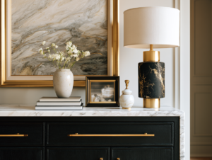
Designers pick one or two metal tones and commit. Warm brass and matte black are the current all-stars — both affordable, widely available, and they work together beautifully. Mixing warm metals (brass + gold + bronze) is fine. Mixing warm and cool (brass + chrome) is where it gets visually noisy.
The good news is that cabinet hardware, lamp bases, and picture frame edges are all easy, affordable swaps that instantly make a room feel more cohesive.
The products that fix it you can find on Wayfair.com:
- Matte black or warm brass cabinet pulls (set of 10) — one of the highest ROI swaps in any kitchen or bathroom.
- Brass or black picture frame set — replace mismatched frames with a consistent metal edge across your gallery wall.
9. You’re Missing Texture (Everything Is Flat)
A room can have beautiful furniture, the right colors, and good scale — and still feel flat. Nine times out of ten, texture is what’s missing.
Texture is what makes you want to touch something. It’s the weave in a linen curtain, the roughness of a raw clay vase, the nubby surface of a boucle chair. It adds depth that a photograph can’t fully capture but your eye registers immediately when it’s absent.
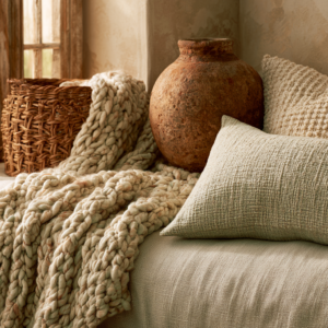
The layering formula: For every smooth, refined surface (lacquered table, flat sofa), add one rough or organic counterpart (rattan, stone, clay, jute, woven). The contrast is what creates richness. A smooth white sofa needs a chunky knit throw and a rough terracotta pot nearby to feel intentional.
My favorite products to fix it that you can easily find on Wayfair.com:
- Chunky knit or waffle-weave throw blanket — affordable, photographable, and adds instant warmth,
- Rattan or seagrass basket (set of 2-3) — storage that also serves as texture. Two birds, one very cheap stone.
- Raw clay or terracotta vase — the anti-plastic, and it costs almost the same.
10. Your Plants Are the Wrong Scale (Or Fake and Obvious About It)
A collection of twelve small plants on a windowsill is a plant hobby. One large, sculptural plant in the corner of a room is interior design. Both are valid — but only one photographs as “expensive.”
The scale problem: Small plants on shelves and sills are charming but scattered. For a room to feel designed, it needs at least one statement plant — something tall enough to fill a corner, substantial enough to anchor a room. A fiddle leaf fig, an olive tree, a bird of paradise, a tall snake plant.
On the fake plant question: modern faux plants have gotten very convincing — but only certain ones. Look for faux options with textured leaves and natural pot options. Avoid the shiny, symmetrical, overly-perfect ones. Those announce themselves immediately.
The products that fix it on Wayfair:
- Large faux fiddle leaf fig or olive tree (5-6 ft) — the convincing ones have variegated, slightly imperfect leaves
- Simple matte ceramic or terracotta pot (10-14″ diameter) — the pot matters as much as the plant. White plastic nursery pots ruin the effect.
11. Your Bed Isn’t Layered (It’s Just “Made”)
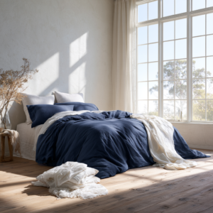
A flat comforter with two standard pillows is a made bed. A layered bed — with a duvet, euro shams, sleeping pillows, a lumbar, and a folded throw at the foot — is a styled bed. The difference is about $40 in pillow covers and five extra minutes in the morning.
The hotel-bed formula designers use:
- White or neutral duvet cover (wrinkled linen reads as intentional; smooth polyester reads as cheap)
- Two euro shams behind your sleeping pillows — these add the height that makes a bed feel full
- A folded throw blanket at the foot in a contrasting texture
- One lumbar pillow in front for the final layer of intentionality
The key: linen, always linen. Even a $35 linen duvet cover from Amazon looks like something out of a boutique hotel. Polyester shines under bedroom lighting and photographs flat.
You can find options like this on Wayfair:
- Linen duvet cover set — look for a washed linen in oat, white, or warm sage.
- Euro pillow shams (set of 2) — the single most impactful $25 upgrade for a bedroom.
- Waffle or chunky-knit throw for the foot of the bed — adds texture and layers instantly.
12. You Haven’t Edited (The Room has Too Much)
This is the hardest upgrade because it costs nothing and requires you to remove things rather than buy them. But it’s the one designers rely on most: the edit.
A room with too much in it doesn’t look full — it looks confused. Every item added to a room is asking for the viewer’s attention. At some point, everything is shouting and nothing is heard. The antidote is negative space — the visual breathing room that makes what is in the room feel worthy of being there.
The weekend edit: Go room by room and pull out anything that doesn’t serve a clear purpose (functional or beautiful, ideally both). Box it up and live without it for two weeks. If you don’t miss it, don’t put it back. What remains will feel curated, intentional, and — here’s the magic — expensive.
The expensive rooms you see in magazines aren’t expensive because they have more. They’re expensive because someone made very deliberate decisions about what to keep.
The Honest Truth About “Expensive-Looking” Rooms
Here’s what it really comes down to: most cheap-looking rooms aren’t under-decorated. They’re under-edited and under-scaled. The curtains are too short. The rug is too small. The art is too tiny. The lighting is too flat.
Fix the scale, layer the texture, commit to a metal finish, and edit out the noise. None of that requires a renovation budget. It just requires knowing what to look for — and now you do.
Start with one upgrade from this list. Not all twelve at once. Pick the one that made you wince a little when you read it, because that’s the one your room has been waiting for.
You can find options